Wednesday, April 20, 2016

The Lost Art of Letter Writing

by Tony Thomas

It seems that letter writing has become something of a lost art. E-mail is ubiquitous. Cursive writing, arcane.

However, there are some great reasons to write letters. Here are some I came up with:

1) Letters are personal: Unlike impersonal (and sometimes annoying) e-mail, letters add a personal touch that cannot be duplicated.

2) Letters are tangible: They can be held and folded. They can be stored and re-read. And, if kept out of direct sunlight and if archival paper is used, they can even be read by future generations.

3) Writing is therapeutic: I derive a great deal of comfort and enjoyment from writing in longhand. My thoughts flow naturally and easily. It is relaxing and mentally stimulating. I would say it is even therapeutic.

4) They will get read: Everyone's e-mail box is stuffed and every e-mail is just one button push from oblivion. How many times have you asked: "Did you get my e-mail"? By contrast, most people are pretty mail-starved these days and your letter will likely find the eyeballs of the recipient.

5) They will be appreciated: As it takes time and effort to write a letter, seal an envelope, attach a stamp and mail it, your intentionality will be admired and appreciated.

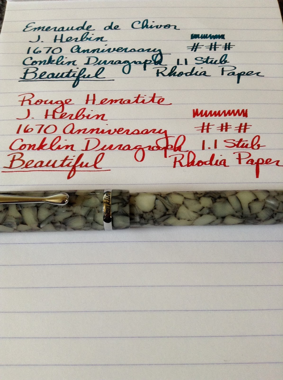
6) They allow you to make productive use of your FPs: What good is owning a bunch of fountain pens if you don't use them? Writing letters is a really good reason.

7) They help you to improve your handwriting: Before I started using fountain pens, I printed everything. Now, I am back to using cursive for the first time since high school and my handwriting is very legible and even somewhat attractive if I do say so myself!

So, pick up a pen and write someone!!

I found a cool Facebook page on this subject:

https://www.facebook.com/Save-the-US-Postal-Service-by-Writing-More-Letters-181969851870534/


Karas Kustoms "Ink" Fountain Pen Review


by Tony Thomas

I have been an admirer of Karas Kustoms pens for a while now. 

In fact, I purchased a few of their rollerball pens previously (the Render K and Bolt in aluminum) to house the ultra-fine Japanese gel refills from Pilot and Uni that I love to use. Of course, I prefer to use fountain pens whenever I can, but as you probably know, ultra-fine fountain pen nibs are not a joy to write with. Plus, there are times when rollerballs are preferable.

If you don't know anything about Karas Kustoms, they are a CNC machine shop located in Arizona that decided to get into the pen business. They achieved their initial visibility through successful Kickstarter campaigns targeted at the burgeoning EDC (everyday carry) crowd. 


What the company does is machine the pens they sell out of metals such as aluminum, brass, and copper. They do this on a CNC (Computer Numerical Control) lathe and then finish the pens by hand. If you would like to see how this is done, check out this You Tube video:

https://www.youtube.com/watch?v=kPIOfH-9bX8

When I reached out to them and they agreed to send me an “Ink” fountain pen for review, I was jazzed. And when I received the pen, I certainly was not disappointed. To put it simply, their pens are a work of art. The level of craftsmanship and detail that goes into these pens is amazing. The one I received was made out of silver-colored polished aluminum with a Bock 250 medium nib.

Although I understand that the pens made out of copper and brass are very heavy, the aluminum pen that I received is comparatively light and well-balanced. The size of the pen appeals to me since I have large hands. The threads are perfectly cut and not sharp and the tapered section is comfortable. This pen also has the most “industrial strength” clip that I have ever seen and it works well (though a clipless version of this pen is also available).

An international converter is provided as well as five-pack of Monteverde ink cartridges. To fill the pen, you need to insert the converter into the bottle, wipe it off, and then put it back into the pen because the nib is slightly recessed into the section. You can also use a syringe with a blunt needle to fill the converter.

The Bock 250 #6 nib is very impressive. It is a very smooth writer and perfectly adjusted. I ordered a spare extra-fine nib unit and ground the medium nib into a custom stub to for letter writing and signatures. The fact that you can easily change nibs makes this pen very versatile, especially if you can’t afford multiple pens.

All in all, I am very pleased with the Karas Kustoms “Ink”. It is an impressive, high-quality fountain pen that is made in the USA. And it is certainly a conversation starter! 

Details:

Weight: 1.3 oz
Length capped: 5-3/8"
Length uncapped: 5"
Pen Does Not Post
Width: 9/16"
Section Width at Narrowest Point: 6/16"


For more information: http://karaskustoms.com/pens/ink-fountain.html


"Ink" Hanging Out With My Other KK Pens
Custom Ground Bock Stub Sample

"Ink" Capped


"Ink" Uncapped with Bock 250 Nib
EF Nib Sample


Full Disclosure: In compliance with FTC 16 CFR Part 255, I hereby disclose that the manufacturer or retailer mentioned in this article provided the product for review purposes with the knowledge that I would provide a full, unbiased and impartial review.


Tuesday, April 19, 2016

J. Herbin Rouge Hematite Review

by Tony Thomas

This is my second review of the J. Herbin 1670 collection of inks.  Up next is Rouge Hematite.

For those who missed the last installment: "The 1670 Collection celebrates the rich life and adventures of J. Herbin, an enterprising French sailor of the mid-17th century. He made a number of voyages to India, collecting ingredients and formulas for his sealing wax and inks. He began making pen inks in his Paris workshop beginning in 1700 with the 'Ink of Ships' and the 'Jewel of Inks.' Today, Herbin inks are widely used and internationally renown."

J. Herbin Rouge Hematite is a beautiful, rich, shade of red.  It is saturated, but not nearly as dense as the Emerald of Chivor ink that I reviewed previously.  Again, I used my Conklin Duragraph with a 1.1 stub for the test.  The flow is excellent and the dry time is reasonable on Rhodia the 80gsm paper that I used.  I did not notice any significant shading with this ink.  It was a pleasure to write with and it is a glorious color of red.  Also, compared to the Emerald of Chivor, it was a breeze to clean it out of my pen after use.  Just like Emerald of Chivor, you get a different color if you shake the bottle.  You can see the flecks of gold if you look closely.  Highly recommended if you need a nice red ink.

For more information: http://www.jherbin.com/1670.shtml


Full Disclosure: In compliance with FTC 16 CFR Part 255. I hereby disclose that the manufacturer or retailer mentioned in this article provided the product for review purposes with the knowledge that I would provide a full, unbiased and impartial review.

Saturday, April 9, 2016

Jet Pens Chibi 2 Pocket Pen

by Tony Thomas

While filling up my shopping cart at Jet Pens, I decided to pick up a few of their Chibi 2 pocket fountain pens.  At less than $3 each, the price was right.  Plus, I noticed that they have received good reviews on their web site.

After testing it out, I have concluded that it is a great little pen.  It has a smooth IPG fine nib, it posts (but not all that securely) and is comfortable to write with.  It comes with a black cartridge and accepts a Monteverde converter (which, sadly, costs almost as much as the pen).  I have decided to stick with cartridges and re-fill them when they run out.

The Chibi 2 is a great snap-cap fountain pen to carry with you in your pocket or purse or to give away to people who would like to see what it is like to write with a fountain pen.  At $2.99, you really can't go wrong!

For more information: 

http://www.jetpens.com/JetPens-Chibi-2-Mini-Fountain-Pen-Fine-Nib/pd/14752


Chibi 2 next to Kaweco Sport and Rosetta Napoleon


Cap, Section and IPG Fine Nib

Writing Sample Mnemosyne 192 Pad

Sunday, April 3, 2016

J. Herbin Emerald of Chivor Review


by Tony Thomas

I received a nice box from Exaclair, the U. S. distributor for J. Herbin containing the four 1670 Anniversary Edition inks.

For those of you who have been out of touch for a while, J. Herbin 1670 is one of the most sought after ink collections currently available.

For a bit of background, from the J. Herbin website: "The 1670 Collection celebrates the rich life and adventures of J. Herbin, an enterprising French sailor of the mid-17th century. He made a number of voyages to India, collecting ingredients and formulas for his sealing wax and inks. He began making pen inks in his Paris workshop beginning in 1700 with the 'Ink of Ships' and the 'Jewel of Inks.' Today, Herbin inks are widely used and internationally renown."

When I opened each individual box, I was quite impressed with the bottles and the elegant metallic cord and wax seal attached to each one -- an extremely creative and elegant design. At a bit over $25 a bottle retail for 50 ml, this is definitely a "luxury class" ink that would probably be reserved for the most important correspondence or writing tasks. Even though I am frugal (just look at the name of this blog), I could definitely see splurging on one or more of these inks for special occasions.

First up is the Emerald of Chivor (or "Emeraude de Chivor" in French), a rich green ink with a touch of blue and a few surprises.  I used my Conklin Duragraph "Cracked Ice" with a 1.1 mm Conklin nib to test this ink.  I just dipped the pen into the ink rather than filling the cartridge converter (I will tell you why later).  Let me say at the outset that this is one of the most concentrated and saturated inks that I have ever used.  It has a rich bluish green color that is definitely reminiscent of a beautiful emerald.  I noticed a bit of subtle shading.  Flow and lubrication were good and dry time seem to be a bit long on Rhodia paper.  Photos don't really do justice to this gorgeous ink.

I had heard that there are gold flecks in the ink but I did not see them in my initial writing samples.  I turned the bottle over a few times and then dipped my pen again.  This time the ink was much darker and appeared to be more textured.  Upon close examination, I could see the gold flecks.  If you look closely at the writing sample below, you can see that the words "Beautiful" and "Rhodia Paper" are certainly darker.  So, you can really get two different color variations from the same ink depending on whether you shake the bottle or not.

You probably are wondering why I did not fill the converter.  Each ink box has a warning that tells you not to leave this ink in your pen's ink reservoir and to carefully clean the nib.  I decided to err on the side of caution, especially since it contains metallic particles.  When cleaning the ink out of the nib and feed, it took quite a bit of effort to remove every trace of the color due to its intense saturation.  I removed the nib from its collar and cleaned them separately.  Although I did not test it, this is probably a good ink to dilute to see if you can get even more color variations.  And you may want to confine use of this ink to pens that can be completely disassembled for thorough cleaning.  

All in all, this is a spectacular ink that will definitely impress the recipient of any correspondence that you choose to create with it.

I will do reviews of the other colors in the near future.

For more information: http://www.jherbin.com/1670.shtml


Full Disclosure: In compliance with FTC 16 CFR Part 255. I hereby disclose that the manufacturer or retailer mentioned in this article provided the product for review purposes with the knowledge that I would provide a full, unbiased and impartial review.